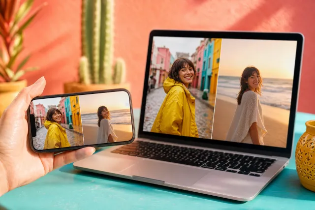
Collages with a blurred background
The background is not a colour anybody chose. It is your own photos, enlarged and blurred, sitting behind the sharp versions.
Every other look asks you to pick a ground and hope it suits the pictures. This one builds the ground out of the pictures, so the question does not arise: the colours behind the collage are, by construction, the colours in it. That single property solves the most common problem in collage making and introduces one of its own.
Made with StudioCollage
Every collage below was made in the editor itself, at full resolution. Open one to start from it.
 Open in the editor
 Open in the editor
 Open in the editor
 Open in the editor
 Open in the editor
 Open in the editor
 Open in the editor
 Open in the editor
 Open in the editor
 Open in the editor
 Open in the editor
 Open in the editor
 Open in the editor
 Open in the editor
 Open in the editor
 Open in the editor
 Open in the editor
 Open in the editor
 Open in the editor
 Open in the editor
 Open in the editor
 Open in the editor
 Open in the editor
 Open in the editor
 Open in the editor
 Open in the editor
 Open in the editor
 Open in the editor
 Open in the editor
 Open in the editor
 Open in the editor
 Open in the editor
 Open in the editor
 Open in the editor
 Open in the editor
 Open in the editor
 Open in the editor
 Open in the editor
 Open in the editor
 Open in the editor
1. It cannot clash, and that is the point
Choosing a background colour is the step most people get wrong, and it is not a failure of taste. It is genuinely hard: the colour has to relate to every photo at once, and photos rarely agree with each other.
A blurred derivative sidesteps it entirely. Warm photos produce a warm ground. A collage of sea pictures produces a blue one. A mixed set produces something muddled and neutral, which is exactly what a mixed set needs. You never have to decide, and the decision is never wrong.
It also changes with the photos. Swap a picture and the background follows, which no fixed colour does. For anybody making the same collage repeatedly with different pictures, that is the practical reason to choose this look.
2. What it needs from your photos
The blur is made from the photos, so photos with nothing in them make a background with nothing in it.
It wants colour variation. A set shot against a white wall produces a pale grey blur, and the whole collage looks like it is floating on nothing. A set with a red jumper, a green park and a blue sky produces a ground with real movement.
It wants some large shapes. Fine detail vanishes in the blur; big blocks of tone survive it. A landscape with a horizon blurs beautifully. A crowd of small faces blurs to mush.
If your photos are uniform, this look has nothing to work with and one of the chosen grounds will serve you better.
3. The problem it introduces
A blurred photo is not a quiet background. It has areas of light and dark, and a sharp photo laid over it can sit on a bright patch at one corner and a dark one at the other.
Two consequences worth knowing before you commit.
- Edges get lost. A pale photo over a pale part of the blur has no boundary. This is why the look pairs a soft shadow and rounded corners with the blur: both exist to put a visible edge back.
- Text is unreliable. Any caption placed over the background will be readable in one place and invisible a centimetre away, and it changes when you swap a photo. Put text inside a cell or leave it out.
4. Where it belongs
This is the most contemporary look in the set, and it reads as such. It is what a music app does behind an album cover and what a phone does behind a lock screen, so it carries a strong association with screens.
Good for: stories, posts, anything going straight onto a phone. Travel and food especially, because both produce the colour variation it needs.
Less good for: print. The blur is a large area of continuous tone, which is where inkjet banding shows most, and it uses a lot of ink to produce something deliberately out of focus.
5. Make one
Pick a collage above and it opens with the background derived from its photos. Swap them and the ground follows, which is worth watching once to see how much it changes.
If your photos turn out too uniform for it, pastel gives a soft ground that does not depend on them, and minimal removes the question.
Questions about Blurred background collages
How does a blurred background collage work?
The background is built from your own photos, enlarged and blurred, rather than from a colour you pick. That means it always relates to the pictures in front of it, and it updates when you swap one. Choosing a background colour that suits every photo at once is the step most people get wrong, and this removes it.
Why does my blurred background look flat and grey?
Because the photos are uniform. A set shot against a white wall has nothing for the blur to work with, so the ground comes out pale and the collage floats on nothing. The look needs colour variation and some large shapes: fine detail disappears in a blur, big blocks of tone survive it.
Can I put text on a blurred background?
Not reliably. A blurred photo has light and dark areas, so a caption is readable in one place and invisible a few centimetres away, and it moves when you change a photo. Put text inside a cell, where the ground behind it is known, or leave it out.
Why do the photos have shadows and rounded corners in this look?
To put an edge back. A pale photo over a pale part of the blur has no visible boundary, so the soft shadow and the rounding are there to separate the sharp layer from the blurred one. They are not decoration in this look, they are doing structural work.
Is it good for printing?
Less than most. The blur is a large area of continuous tone, which is exactly where inkjet banding shows, and it spends a lot of ink on something deliberately out of focus. It was built for screens, and it looks best on a phone.