Travel photo collage templates
A trip leaves you with four hundred photos and about six that anyone else wants to see. The collage is where you find out which six.
Square post 1080x1080
Portrait post 1080x1350
Story 1080x1920
4K wallpaper 3840x2160
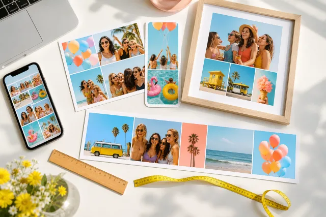
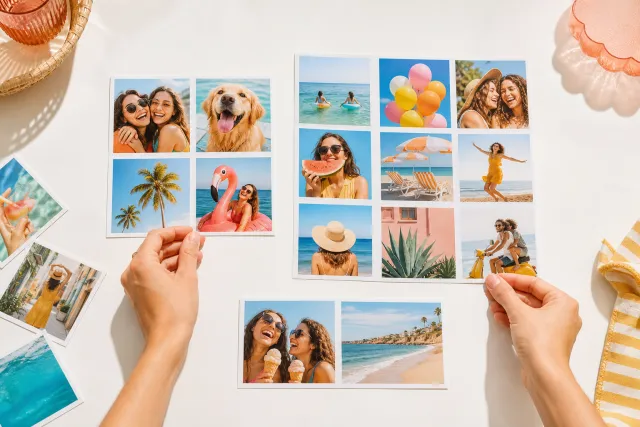
Travel photos have a particular failure mode: they are good and they are all the same kind of good. Forty views, each of them nice, none of them a moment. A collage that reproduces that reads as a screensaver. The layouts below are chosen to break the sameness, by forcing a mix of distances and by putting a person back in the picture.







Made with StudioCollage
Every collage below was made in the editor itself, at full resolution. Open one to start from it.
 Open in the editor
 Open in the editor
 Open in the editor
 Open in the editor
 Open in the editor
 Open in the editor
 Open in the editor
 Open in the editor
 Open in the editor
 Open in the editor
 Open in the editor
 Open in the editor
 Open in the editor
 Open in the editor
 Open in the editor
 Open in the editor
 Open in the editor
 Open in the editor
 Open in the editor
 Open in the editor
 Open in the editor
 Open in the editor
 Open in the editor
 Open in the editor
 Open in the editor
 Open in the editor
 Open in the editor
 Open in the editor
 Open in the editor
 Open in the editor
1. Choosing six out of four hundred
Sorting by favourites does not work, because your favourites are all the same photo. This does.
- One wide. The view that made you stop walking. Only one, and it goes in the biggest cell.
- One with a person in it. Anyone, including you. A trip collage with no people in it is a postcard rack, and this single photo is what turns it into a memory.
- One detail. A door, a plate of food, a sign, a texture. Close, and preferably unremarkable.
- One that was an accident. Blurry, tilted, taken from a moving train. It is the one that dates the trip and the one you will like in ten years.
- Two more of anything, chosen to be different from the four above rather than good on their own.
Six chosen this way beat twelve chosen by quality, every time, because the mix of distances is what makes a collage read as a journey rather than as a gallery.
2. Why your best photo looks worst in a grid
A landscape is wide because the width is the subject. Put it in a square cell and the crop removes exactly what made it: the horizon shortens, the sky is cut, the scale disappears.
So landscapes need wide cells or none at all. In practice:
- A layout with one full width band at the top and smaller cells underneath. The band takes the view, the cells take everything else.
- A row of three wide cells stacked, which suits three horizons: sea, mountain, city.
- Never a square grid of landscapes. Six squares of six views is the most common travel collage and the least interesting.
Portraits and details, by contrast, are happy in square cells, which is why a mixed set arranges so much better than a set of views.
3. One trip, one place, or one year
Three different collages, and choosing which one you are making decides the layout before anything else.
| Scope | Photos | Layout | Ordering |
|---|---|---|---|
| One trip | 4 to 6 | Hero with supports | Chronological, so it reads as a journey |
| One place, several visits | 4 | Even grid, 2 x 2 | By season or by year, so the change is the subject |
| A year of travel | 9 to 12 | Even grid, print size | Chronological, one per trip |
| A route | 3 to 5 | A strip, left to right | In order, always |
The year grid is the one worth printing. Twelve travel photos on A3 is an object; the same twelve on a phone is a thumbnail sheet.
4. The colour problem nobody mentions
Travel photos come from wildly different light. A morning in the mountains is blue, a market at noon is neutral, a beach at six is orange. Put them in one grid and the collage looks like it was assembled from four different holidays.
Two ways out, and they pull in opposite directions.
Lean into it. Order the photos so the colour shifts gradually across the collage, cool to warm. It reads as a day passing and it looks deliberate.
Or neutralise it with a background that is present in all of them. Sand, stone, off-white. A strong background colour makes mismatched photos look chosen rather than collected.
What does not work is a white background with a mixed set: white makes every colour cast visible at once.
5. Make one
Pick a template above and it opens at the right size with the layout ready. Drop your photos in and press Auto if you are unsure: with travel photos it is unusually useful, because it matches each photo's shape to the cell that crops it least, which is exactly the problem a wide landscape creates.
Fifty more ideas, including what to do with tickets and maps, are in the travel collage guide. For a wall print, the print sizes matter more than the layout.
Questions about Travel collages
How do I choose which travel photos to use?
Not by favourites, because your favourites are all the same photo. Take one wide view, one with a person in it, one close detail, one accident, and two more chosen to be different from those four. The mix of distances is what makes a collage read as a journey instead of a gallery.
Why do my landscape photos look bad in a collage?
Because a landscape is wide for a reason, and a square cell removes exactly that: the horizon shortens, the sky is cut, the scale goes. Landscapes need wide cells. A layout with one full width band at the top and smaller cells underneath solves it in one move.
How many photos for a holiday collage?
Four to six for a screen. Nine or twelve only for a print, where an A3 gives each photo enough room to still be a photograph. The most common travel collage, six squares of six views, is also the least interesting, because nothing distinguishes one cell from the next.
My photos are all different colours, what do I do?
Either lean into it, ordering them so the colour shifts gradually across the collage from cool to warm, which reads as a day passing; or neutralise it with a background colour present in all of them, like sand or stone. A white background is the worst choice for a mixed set: it makes every colour cast visible at once.
What is the best layout for a road trip?
A strip, left to right, in order. A route is a sequence and any grid destroys the one thing that makes it legible. Three to five cells, and let the widest one be wherever the trip actually opened up.