Polaroid photo collages
A white frame with a deep lip at the bottom. It is the most recognised photo object there is, and the reason it works is a detail most imitations get wrong.
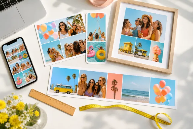
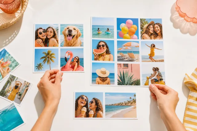
Every collage on this page uses the same treatment: a thick white border, warm paper rather than pure white, and a soft drop shadow under each print. What makes it read as a polaroid instead of just a bordered photo is that the border is not even. Below is what that means in practice, and what to put in the space it leaves.
Made with StudioCollage
Every collage below was made in the editor itself, at full resolution. Open one to start from it.
 Open in the editor
 Open in the editor
 Open in the editor
 Open in the editor
 Open in the editor
 Open in the editor
 Open in the editor
 Open in the editor
 Open in the editor
 Open in the editor
 Open in the editor
 Open in the editor
 Open in the editor
 Open in the editor
 Open in the editor
 Open in the editor
 Open in the editor
 Open in the editor
 Open in the editor
 Open in the editor
 Open in the editor
 Open in the editor
 Open in the editor
 Open in the editor
 Open in the editor
 Open in the editor
 Open in the editor
 Open in the editor
 Open in the editor
 Open in the editor
 Open in the editor
 Open in the editor
 Open in the editor
 Open in the editor
 Open in the editor
 Open in the editor
 Open in the editor
 Open in the editor
 Open in the editor
 Open in the editor
1. The bottom lip is the whole effect
A real instant print has a wide margin at the bottom and narrow ones on the other three sides, because that is where the chemistry pod sat. Everything else about the look can be dropped and it still reads as a polaroid; drop that and it stops immediately.
The ratio is roughly four to one. If the side margins are 5mm, the bottom is 20mm. Imitations usually make the frame even, and the result looks like a photo in a mount rather than an instant print, which is a completely different object.
This matters at thumbnail size more than at full size. A collage of six prints seen on a phone is six white rectangles, and the asymmetry is the only cue that survives the shrinking.
2. Fewer prints than you think
The frame costs space. Each print loses roughly a fifth of its area to the border, so a nine print polaroid collage gives each photo about half the pixels of a nine cell grid with no borders.
| Prints | Reads as | Use it for |
|---|---|---|
| 1 | A single keepsake | A gift, a print, a phone wallpaper |
| 2 to 4 | A handful on a table | Almost everything. This is the sweet spot |
| 6 | A scattered set | Works, but faces get small on a phone |
| 9 or more | A wall of white | Only on paper, and only at A4 or larger |
If you have a lot of photos and want them all, a plain grid serves them better. The polaroid look is for when the object matters as much as the pictures.
3. The white space is for writing
The lip exists to be written on, and leaving it blank wastes the only part of this look that no other look has.
A date, a place, or a name. Short. It is a caption, not a sentence, and the space is about two words wide at a readable size.
Handwriting beats a typeface, and if you are using a typeface, one that leans. A crisp geometric sans in that space fights everything else about the treatment.
One more thing worth knowing: text in the lip survives being posted at small sizes far better than text laid over a photo, because there is nothing behind it competing.
4. Which photos suit it
The warm paper and the soft filter push everything slightly amber, which flatters some photos and ruins others.
- Good: indoor light, skin tones, evening, anything already warm. The treatment amplifies what is there.
- Good: slightly imperfect photos. Grain, motion blur and a wonky horizon all read as intentional inside this frame, which is not true of a clean grid.
- Bad: anything where the colour is the subject. A blue sea goes green, a white wedding dress goes cream.
- Bad: screenshots, documents, product photos. The nostalgia reads as a mistake.
5. Make one
Pick a collage above and it opens in the editor with the look already applied. Swap the photos and the treatment stays.
If you want the same photos without the frame, the minimal look is the opposite choice, and black and white keeps the object feeling without the amber.
Questions about Polaroid collages
What makes a collage look like a polaroid?
The uneven border. A real instant print has a bottom margin about four times the width of the other three, and that asymmetry is the single cue people recognise. An even white frame reads as a mount, which is a different object entirely. It matters most at small sizes, where nothing else survives.
How many photos should a polaroid collage have?
Two to four. Each print loses about a fifth of its area to the frame, so nine prints give each photo roughly half the pixels a plain nine cell grid would. Six works if it is going on paper. Beyond that you are looking at a field of white with small pictures in it.
What do I write in the white space at the bottom?
A date, a place or a name, and nothing longer: the space is about two words wide at a size anybody can read. Handwriting or a leaning typeface suits it; a crisp geometric sans fights the rest of the treatment. Text there also survives small sizes far better than text over a photo.
Which photos work best with a polaroid look?
Warm ones, and slightly imperfect ones. Indoor light and skin tones are flattered by the amber cast, and grain or motion blur reads as intentional inside the frame. Avoid photos where a colour is the point: the treatment turns a blue sea green and a white dress cream.
Is the polaroid look free?
Yes, and there is no watermark on the result. It exports at full resolution like every other look, so a polaroid collage is as printable as a plain one.