
Two photo collages
Two photos is not a collage with four missing. It is a comparison, and it is the only count where the relationship between the pictures is the whole subject.
Square post 1080x1080
Portrait post 1080x1350
Story 1080x1920
A4 print 2480x3508
Every other count on this site is a collection: photos that belong together and are shown together. Two is different. Put two pictures side by side and a viewer reads them as one statement about the difference between them, whether or not that was intended, and everything that follows from that is either a strength to use or a trap to avoid.

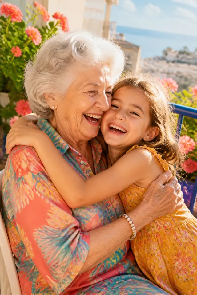





Made with StudioCollage
Every collage below was made in the editor itself, at full resolution. Open one to start from it.
 Open in the editor
 Open in the editor
 Open in the editor
 Open in the editor
 Open in the editor
 Open in the editor
 Open in the editor
 Open in the editor
 Open in the editor
 Open in the editor
 Open in the editor
 Open in the editor
 Open in the editor
 Open in the editor
 Open in the editor
 Open in the editor
 Open in the editor
 Open in the editor
 Open in the editor
 Open in the editor
 Open in the editor
 Open in the editor
 Open in the editor
 Open in the editor
 Open in the editor
 Open in the editor
 Open in the editor
 Open in the editor
 Open in the editor
 Open in the editor
 Open in the editor
 Open in the editor
 Open in the editor
 Open in the editor
 Open in the editor
 Open in the editor
 Open in the editor
 Open in the editor
 Open in the editor
 Open in the editor
1. The eye compares whatever you give it
With two cells there is nothing else to look at, so the viewer looks for the relationship. That is why the strongest two-photo collages are the ones where the relationship is deliberate.
| Pair | What it says |
|---|---|
| Same place, years apart | Time passing. The strongest of all |
| Same pose, two people | Family resemblance |
| Before and after | Change, and it needs identical framing |
| Wide and close, same subject | Context and detail |
| Two unrelated good photos | Nothing, and it shows |
The last row is the common failure. Two photos that merely happen to be nice look like a collage that ran out of material.
2. Matching matters more here than anywhere
With six cells a mismatched photo is one of six. With two it is half the picture.
Same framing, if the point is change. A before-and-after where the camera moved is not a before-and-after, it is two photos. Standing in the same spot matters more than the photos being good.
Same orientation. A portrait beside a landscape gives one cell far more area than the other and the comparison stops being fair.
Similar light. One sunny and one grey reads as a difference in weather rather than in subject, which is rarely the point.
3. Side by side, or stacked
The only layout decision at this count, and it is not arbitrary.
Side by side for people, faces and portraits. Two portraits stacked leaves a wide gap of nothing on each side.
Stacked for landscapes, and for anything going in a story. Two wide photos side by side become two thin strips.
No gap, or a wide one, not in between. Touching photos read as one image in two halves, which suits before-and-after. A generous gap reads as two separate pictures being compared. A thin gap looks like an accident.
4. Make one
Pick a collage above and it opens ready. Before you choose a layout, say what the two photos have to do with each other: if the answer is nothing in particular, a third and fourth photo will help more than any arrangement.
The side-by-side guide covers the mechanics, and before and after covers the framing.
Questions about 2 photos collages
How do I put two photos side by side?
Pick a two-cell layout and choose between side by side and stacked: side by side for faces and portraits, stacked for landscapes and for anything going in a story. Two wide photos placed side by side become two thin strips, which is the usual mistake.
What makes a good two photo collage?
A deliberate relationship between the pictures. The same place years apart, the same pose with two people, a before and after, or a wide shot with a close one. Two photos that merely happen to be nice read as a collage that ran out of material, because with only two cells the viewer has nothing to look at but the relationship.
Should the two photos touch or have a gap?
One or the other, not in between. Touching reads as a single image in two halves, which suits a before and after. A generous gap reads as two pictures being compared. A thin gap looks like an accident rather than a decision.
Does it matter if the photos are different shapes?
More than at any other count. With six cells a mismatch is one of six; with two it is half the picture. A portrait beside a landscape gives one cell far more area than the other, and the comparison the viewer is making stops being a fair one.