Heart shaped photo collage templates
A heart cuts away the corners of a photo, which is most of the photo. Whether it works comes down to one thing: what was in the corners.
Square post 1080x1080
Portrait post 1080x1350
A4 print 2480x3508
Two ways to use the shape, and they are different objects. One large heart is a portrait with a shaped edge, and it lives or dies on the single photo you choose. Several hearts side by side is a collage where the repeated shape does the work and no individual photo has to carry it. Templates for both are below.

Made with StudioCollage
Every collage below was made in the editor itself, at full resolution. Open one to start from it.
 Open in the editor
 Open in the editor
 Open in the editor
 Open in the editor
 Open in the editor
 Open in the editor
 Open in the editor
 Open in the editor
 Open in the editor
 Open in the editor
 Open in the editor
 Open in the editor
 Open in the editor
 Open in the editor
 Open in the editor
 Open in the editor
1. Which photos survive being cut to a heart
A heart keeps the middle and throws away the four corners, plus a wedge out of the top centre. That is a lot, and it is not distributed evenly, so a photo either suits it or does not.
| Photo | In a heart | Why |
|---|---|---|
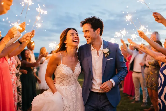
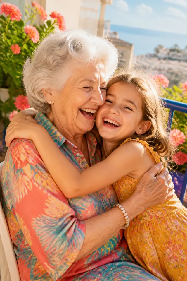
| Two people close together, framed loosely | The best case | The subject sits where the shape is widest and the discarded corners were background anyway |
| One face, centred | Works | Nothing important is near a corner. Leave headroom: the dip cuts into the top middle |
| A wide landscape | Fails | What made it a landscape was the width, and the heart removes exactly that |
| A group standing in a line | Fails | The people at each end are in the corners, so they are the ones cut |
| Texture, flowers, sky, confetti | Good filler | No subject to lose. Useful for the smaller hearts in a multi-heart layout |
The single most common disappointment is the group photo: it is the one people most want in a heart and the one the shape damages most.
2. The one part everybody gets wrong
The top of a heart is not flat, it dips into the middle. A photo placed to look centred in a rectangle ends up with that dip taken out of the top of the head.
So leave headroom. In practice: after dropping the photo in, drag it down a little inside the cell until there is visible space above the subject. Ten seconds, and it is the difference between a heart that looks made and one that looks cropped by accident.
The bottom point is the opposite problem and much more forgiving. It tapers, so it shows only whatever was at the very bottom of the frame. Ground, a table, a jumper. Nobody looks at it.
3. What makes it look cheap
Four things, in order of how much damage they do.
- A jagged edge. The curve is drawn in pixels, so at 500 px it stairsteps visibly. Export at 1500 px or more on the long side and it disappears. This is the biggest single giveaway.
- A busy background behind it. A shape needs its silhouette to read. On a patterned background the heart stops being a heart and becomes a hole. Plain, in a colour taken from the photo.
- A hairline border. On a curve a thin outline looks like a rendering error rather than a decision. Either none, or a generous one.
- A drop shadow. Whatever the temptation. It reads as a nineties clip-art heart and nothing else does more to date the result.
4. Several hearts rather than one
A grid of shaped photos is a different exercise and often the better one, because no single photo has to be perfect for the shape.
Four hearts, two by two. The repetition carries it. Mix them: two with people, two with texture or colour, so the eye has somewhere to rest.
One large, two small. The large one is the photo that matters and the small ones can be anything, because at that size they read as colour rather than as pictures.
A row of three. Reads as a sequence. Good for then-and-now-and-now, or three people.
The rule that holds across all three: vary the distance. Four hearts all containing a face at the same scale looks like a form. One close, one wide, one detail looks composed.
5. The other shapes, and when they beat a heart
A heart is not always the right shape, and changing it is often the whole fix.
A circle cuts evenly all the way round, with no dip and no point, so it damages a photo far less. It is the shape to use when the photo matters more than the gesture.
An arch is flat along the bottom and curved on top. It keeps the full width at ground level, which is why it works for a standing person or a building where a heart would not.
A star takes five bites out of the frame instead of two, so only texture and colour survive it. Worth it when the shape is the message.
All of them are one click apart in the editor, so trying the same photo in three shapes costs nothing and usually settles the question.
6. Make one
Pick a template above and it opens with the shape already applied. Drop your photo in, drag it down a little so there is headroom under the dip, and export at 1500 px or more.
To change the shape afterwards, select the photo and pick another one: heart, circle, arch, hexagon, diamond, star or a soft blob. The photo stays where it is and only the cut changes.
The longer version, with backgrounds and what to do about borders, is in the heart collage guide.
Questions about Heart shape collages
How do I make a heart shaped photo collage?
Pick a heart template, drop your photo in, then drag it down slightly inside the shape so there is space above the subject. The top of a heart dips into the middle, so a photo that looks centred in a rectangle loses the top of the head. Export at 1500 px or more so the curved edge stays smooth.
Which photos work in a heart?
Two people close together and loosely framed is the best case: the subject sits where the shape is widest and the discarded corners were background. A centred single face works with headroom. Wide landscapes and group photos in a line both fail, because what the heart removes is exactly the width they needed.
Why does my heart look jagged?
It was exported too small. The curve is drawn in pixels, so at 500 px it stairsteps. At 1500 px or more the edge is smooth. This is the most common reason a shaped photo looks homemade rather than made.
Can I put several photos in a heart shape?
Yes, as several hearts rather than as one heart divided up. A two by two of hearts, or one large with two small, and the repeated shape carries the composition so no single photo has to be perfect for it. Mixing distances, one close, one wide, one detail, is what stops it looking like a form.
Is a heart always the best shape?
No. A circle cuts evenly all the way round with no dip and no point, so it damages a photo far less and is the better choice when the photo matters more than the gesture. An arch keeps the full width at the bottom, which suits a standing person. Changing the shape is one click, so trying three settles it faster than deliberating.