How to add text to a photo collage: fonts, outlines and where to put the words
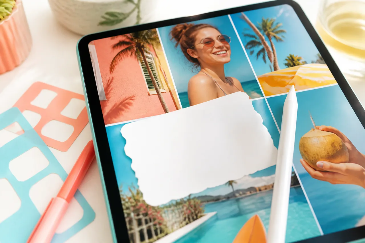
Text on a collage fails in two ways: it lands on a busy photo and disappears, or it shouts over the pictures it was meant to caption. The fix is not a fancier font. It is placing the words where the collage has room, and giving them an edge the photo cannot swallow.
1. Where the words go
Placement solves most of the readability problem before any styling. Four places that work, in order of preference:
- A quiet cell. Sky, sea, a plain wall, a tablecloth. Reframe the photo so the quiet area is where the text goes. The collage reads as designed, not labeled.
- A text cell. Give the words their own cell, filled with a color taken from the photos. One cell out of six or nine, usually a corner. This is how magazines do it, and it never fights a photo.
- The border or the gap. A wide bottom border in white or a color, with the title in it, like a Polaroid caption. Works for every layout and prints well.
- The bottom band of the hero. The lower fifth of the largest cell, over a gentle gradient that darkens the photo just there. Common on social posts; needs the gradient or an outline.








A wide hero with its lower band free of faces, and a magazine layout where a small cell could hold the title instead of a photo. Both leave the words somewhere to live.
Never on a face, never across a gap (the gap cuts the letters), and never in a zone the platform covers: the top and bottom bands of a story, the bottom corners of a Facebook cover, the side strips of a square post that the 3:4 Instagram grid trims. The sizes guide lists those zones.
2. Which fonts, and how many
A collage already has a lot going on. The type should be the calmest thing on it.
- One font for the job, two at most. A bold sans-serif for the title or the date; optionally a script for a single warm word (a first name, "Summer", "Thank you"). Three fonts look like a flyer.
- Bold beats thin on photos. A thin or light weight breaks up over texture. Use regular for captions on a plain cell, bold or black for anything over a photo.
- Sans-serif for numbers and dates. Scripts turn a date into a puzzle.
- Uppercase for short labels (BEFORE, AFTER, 2026) with a little letter spacing; sentence case for anything longer than three words.
- Match the mood, not the photo. A wedding gets a serif or a fine script; a kids' birthday gets a rounded bold; a trip gets a condensed sans. StudioCollage ships 95 fonts, from display to handwritten; pick from the mood, then stop.
Let Auto lay them out, then fix what you want.
Free, no watermark, and your photos stay on your device.
Open StudioCollage3. Outline, shadow and boxes
When the text has to sit on a photo, give it an edge. Three tools, from subtle to strong:
- Drop shadow. A soft, dark shadow a few pixels below the letters. Invisible when it works; the letters just read. Good on mid-tone photos.
- Outline. A thin stroke in the opposite tone (dark outline on light text, white outline on dark text), two to four pixels on a 1080 pixel collage. Readable on anything, a little louder than a shadow. Keep it thin: thick outlines look like a meme.
- A box or a band. A solid or 70 percent opaque rectangle behind the text, in white, black or a color taken from the photos. The strongest option, and the right one for a caption that must be read (a date on a memorial collage, a price on a product strip).
Color: pick text colors from the collage itself. White or near-white is the safe default over photos; a color from a dominant object in one of the cells ties the words to the pictures. Avoid pure red and pure yellow at small sizes, which blur on screens.
4. Size: the thumbnail test
Most collages are first seen as a thumbnail: in a feed, in a grid, in a chat bubble. Shrink the collage to the size of a postage stamp on the screen. If the title is still readable, it is big enough; if only the photos survive, enlarge the text or shorten it.
Rules of thumb on a 1080 pixel wide collage: a title at 60 to 90 pixels of letter height, a date or a name at 40 to 50, a caption at 30 to 36 and only on a quiet cell. On a print at 300 DPI, multiply by the paper: a title on an 8 x 10 needs about 200 pixels of letter height to be read across a room.
5. Add text in StudioCollage
- Build the collage first, text last. The layout decides where the words can go.
- Open StudioCollage, pick the format, add the photos, choose or auto-generate a layout.
- Tap Text, type the words, keep them short.
- Pick the font from the mood (bold sans for a date, a script for a name), then the color from the collage with the picker.
- Add a shadow or a thin outline if the text sits on a photo; skip both if it sits on a text cell or a border.
- Drag it to a quiet area, away from faces and platform zones, and check the thumbnail view before downloading.
A few stickers are there too (hearts, stars, seasonal sets), curated so they decorate without drowning the photos. See text and stickers for what is included.
6. What to write
- A date or a year: the most useful text on a collage, and the easiest to place. "Summer 2026", "June 14".
- A name: the person, the dog, the place. One word, one script font, one cell.
- A number: the age on a birthday collage, the anniversary, the miles of the trip.
- Labels: BEFORE and AFTER in the corners of a comparison, THEN and NOW on a pair.
- Nothing: the right answer for most collages. If the photos say it, let them.
Frequently asked questions
How do I add text to a collage for free?
Open a collage maker that has a text tool and no watermark, such as StudioCollage in the browser: build the collage, tap Text, type, pick a font, a color and an outline, drag it into place, download. Google Photos and most phone gallery tools have no text on collages.
What font is best for a photo collage?
A clean sans-serif in bold for titles and dates (it stays readable at small sizes), a script or handwritten font only for short words like a name or "Summer 2026". Use one font, two at most, and never a thin weight over a photo.
How do I make text readable on a busy photo?
Three options, in order of subtlety: a soft drop shadow, a thin outline in a contrasting color, or a solid or semi-transparent box behind the text. Or move the text to a quiet cell (sky, wall, water) or into a gap or border.
Where should the text go in a collage?
On a quiet area, never on a face. The bottom band of a hero cell, a dedicated text cell in the grid, the border, or the background between cells. Keep it out of the zones a platform covers: the bottom of a story, the corners of a cover.
How big should the text be?
Readable at thumbnail size. On a 1080 pixel wide collage, a title needs about 60 to 90 pixels of letter height; a caption 30 to 40. If you cannot read it when the collage is the size of a stamp, it is too small.